Crimes against aesthetics: architectural adventures in Hobart.
Less is more, they said. Form follows function. A house is a machine to live in.
And so, a hundred years ago, led by Le Corbusier and the German avant-garde, architecture began its journey into the dark tunnel of modernism. The whole built environment, from individual buildings to whole urban settings, were turned into industrial commodities. Offices, houses and apartment buildings changed so profoundly that they became barely distinguishable from manufacturing plants or, occasionally, oil refineries.As the machine took over, humanity lost. Concrete, glass and steel replaced timber, brick and stone. All over the world, newly industrialised building methods turned cities into concrete-and-glass forests and made dark canyons of the streets beneath.
All human scale was lost, any contact with the natural world diminished or eliminated. People became subordinated to the machinery of modernist architecture.
Smaller cities like Hobart escaped the worst. Our streets are still streets, not canyons. Nevertheless, modernism – often of the most carelessly commercial kind – have scarred the place and changed its character. Think of Ali Sultan’s dreadful concrete car-parks, the Telstra centre, the faceless office blocks which now dominate the CBD.
There is at least some hope that these places might have a limited commercial life, that one day we will be rid of them. That’s not so with some of the greatest excrescences modernist architects and their enablers have inflicted upon the city. These will remain, possibly for centuries.
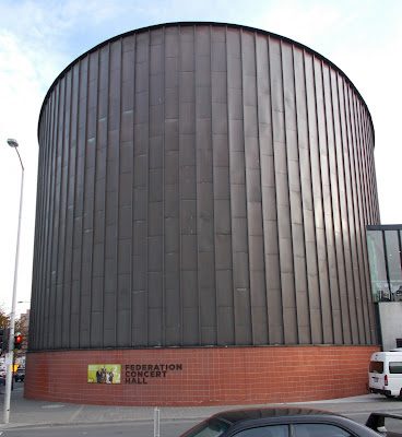
Take, for instance, Hobart’s ugliest building, the execrable Federation Concert Hall, like a dalek with ideas above its station. “Airports are ugly,” wrote Douglas Adams. “Some are very ugly. Some attain a degree of ugliness that can only be the result of a special effort.”
If only he had seen this place.
You can imagine the special effort taking place in the stylish architectural office that had been given the job of building a much-needed concert hall in Hobart.
"Wasn't there a gasworks next door? It would have had a gasometer, wouldn't it?"
“What a wonderful idea!” came the little squeals of delight. “Let’s build another gasometer and call it a concert hall!”
And so they did. They made that special effort. So now, everyone coming into the city, past its lovely natural setting, sees this. Gasometer or garbage bin? They can hardly miss it.
Modern universities are barely more inspiring than airports,
so the migration of the University of Tasmania into the CBD has revealed a
special effort second only to the dual-purpose concert hall and gasometer. The
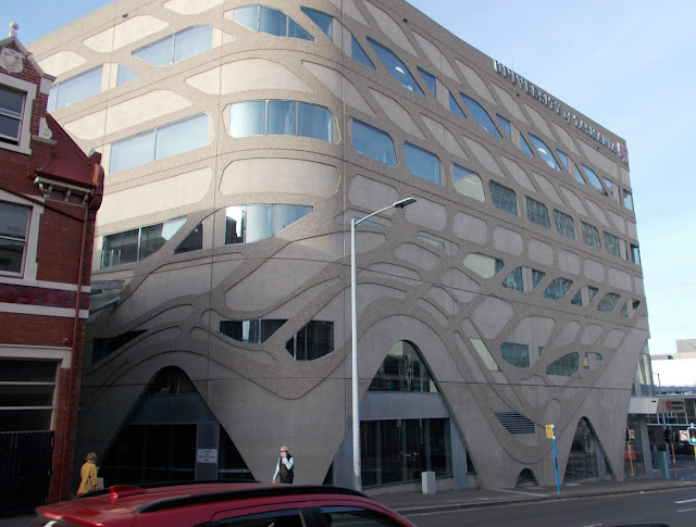
jewel in their sullied crown is the Menzies Centre in Campbell Street.
This is the modernist industrial ideal at its inhuman worst. Concrete and a bit of glass, blocky, aggressive and supremely ugly, occupying every square millimetre of available space. The university’s architects (dwell on that for a moment: architects did this, a university did this) thought, perhaps, to detract from the brutal horror of their creation by playing around with the shapes of the windows.
It really didn’t work, did it?
Materials and methods are the twin keys to modernist architecture. Concrete, glass and steel have allowed buildings to become taller and cheaper. This has been supercharged by the standard construction method – a central core of reinforced concrete containing lifts and services, concrete floors radiating out from the core and an insubstantial curtain wall hanging from them.
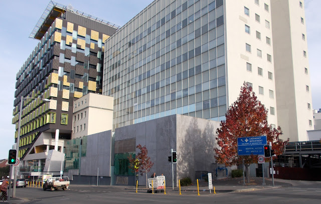
When you apply to this the less-is-more maxim, you get a very plain structure that can vary between bland and overbearing. This characterised the high-rise buildings of the 1950s and the 1960s, such as the Royal Hobart Hospital’s A-block. It’s all a bit, well, blah.
“Modern decoration has no decoration,” instructed Le Corbusier. But recently, even architects seem to have tired of the blandness of less-is-more. Less, after all, is just as it always has been. Less.
They’ve rediscovered the need for decoration so loathed by their predecessors. The hospital’s new K-block, next to the old A-block, shows this. Those blocky protuberances look suspiciously – decorative!
Rather than displaying the bare nature of their construction, new buildings try to hide it. They just don’t do it very convincingly.
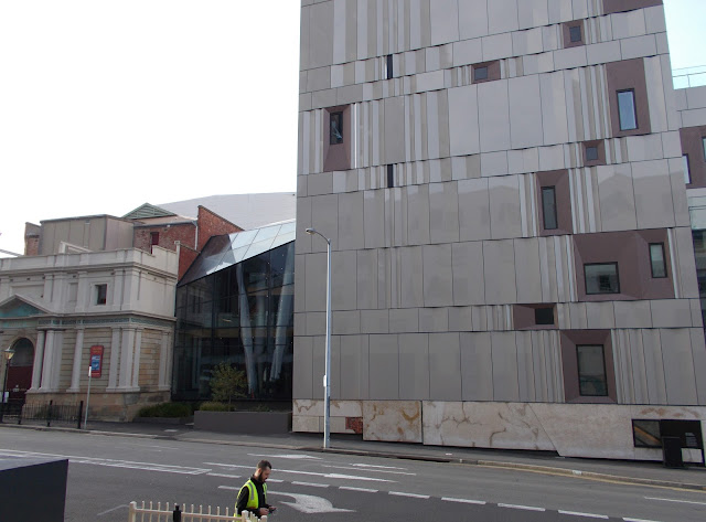
Take the new Hedberg arts building (yes, the university again) that looms over the lovely little 1835 Theatre Royal. Inside, the Hedberg is spacious, attractive and comfortable. Its use of generously high ceilings and timber panelling provides a sense of calm and style. And it provides the theatre a large foyer and bar area that it always needed and never had.
Outside, it’s not so good.
The architects clearly wanted to keep all that grey concrete out of sight, so they covered it up cheaply with the easiest material to hand – cladding. But this conceals only the surface. It makes no contribution at all to the fact that this building is a blockhouse. And what will all that shiny cladding look like in 50 years?
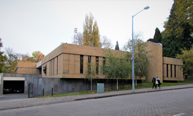
But there is one major post-war building in Hobart – and only one – that counts as genuinely distinguished. That’s Peter Partridge’s superb Supreme Court building on Salamanca Place, just opposite John Lee Archer’s 1838 Parliament House.
It runs against the reigning nostrums of modernism. It has load-bearing walls, sandstone, timber and, above all, an utter lack of pomposity. Courts were traditionally designed to intimidate. This one does the opposite. Humans have a place here.
The court building – actually it’s a collection of buildings – opened in 1975. Finally, 35 years late, the architecture profession acknowledged that Partridge’s court is a rather fine affair. In 2010 the Institute of Architects gave it the Award for Enduring Architecture, saying this in the citation:
“From Salamanca Place a slate base folds up like a piece of carved landscape and supports two sandstone-clad pavilions. This is a building that is indebted to classicism but carries the burden of a period of architecture much maligned for its material brutality. The use of materials here is super direct and the detailing studious. Inside, the complex is judicially innovative through the planning of four courts in the round. The interior carries the gravity of the building’s function but is human in its detail and scale.
“The complex is in remarkably original order because of the skill with which it was designed. Here is a reminder that investment in public architecture has a lasting effect on the city.”
Sadly, there has been nothing like it since. The award jury’s point – that architecture has a lasting effect on a city – is equally true of the inhuman, the soulless and the crassly commercial constructions that so outnumber it.


